
LogoTV

After 10 years of delivering all things LGBT as part of MTV Music Group network, LogoTV was having an identity crisis. A cultural shift had redefined the notion of what “gay” media & representation could or should be. LGBT visibility had increased across the board, every major network had gay characters, Katy Perry kissed a girl and even K-Stew was at least bi. Gay was cool and Logo was not. Our job as the creative team at LogoTV was to try and fix that. Drawing on queer philosophies, artsy outsider confidence, net based trends in communication, and a love for all things pop culture, we created a youthful, celebratory, inclusive philosophy that would speak to today’s growing, non binary world with humor, heart, and style.


Mission: Everyone’s a little Gay
A confident and inclusive statement that reframes gay as an attitude & experience of difference, inviting everyone to embrace their own inner other.
Vision: The Gay Epicenter of Culture.
Culture is for everyone, it can not be divided. By removing the term "gay", we position ourselves as part of the larger cultural ecosystem rather than different than.


A New Positioning: Beyond
Beyond is that unique flair inside us (which could be a little gay), that when courageously cultivated, makes you dance, draw, and draw conclusions outside of the lines. You’ve just got to look Beyond. Beyond what’s expected, Beyond the norm. It’s where the magic is. When the otherwise quiet 10-year old, picking out her first pair of glasses chooses the fluorescent diamond-encrusted cat-eye over the tortoise shell, that’s Beyond. It’s also what makes her a little Gay. When the guy who loves gold chains so much he doesn’t just wear one, but paints his entire body gold, that’s Beyond. It’s also a little Gay. When Thomas Edison lost most of his hearing but decided to invent a record-player regardless, that was Beyond. It was also, a little Gay.


A New Voice: Queer Contemporary Camp
LogoTV is a reclamation of camp through a contemporary lens. It is a mixture of artifice, high and low cultural signifiers, shocking excess and naive authenticity. Our style pushes boundaries, creating a hyperreal world that is at once sophisticated & ridiculous, outré & smart. Just like the internet’s ability to turn cats into stars, Logo’s visual identity can elevate the overlooked or banal to a celebrated icon of Beyondness! By embracing cultural castoffs, underdogs and outsiders in both form and content, we are able to bring to life a unique and unexpected voice that speaks to the inner other, inside us all.


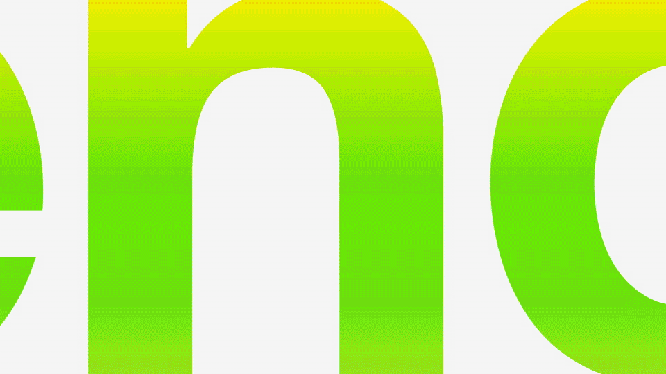
Gradients: We turned a legacy asset from static background to dynamic story teller. The gradient is an inclusive metaphor for all non binary voices in the world. It is seen as an action/transition onair and a hierarchical visual device off. The cliche rainbow takes on new life and while yes, it is crazy, it is also confident, fun, and full of possibilities!


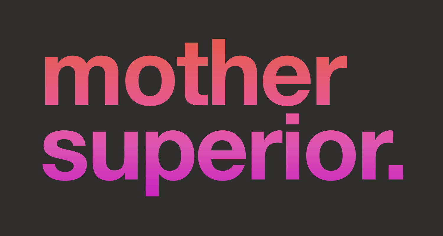
Type: Clean, clear, and confident. Typography is our straight man. It serves as a visual anchor and gives our overall visual approach the balance it needs. This sophisticated mix of serif and sans serif is a minimalist expression of duality, and imbues even our simplest of graphics with an editorialized feel.


